
Customize the user interface
The OneWelcome Identity Platform allows you to customize your user interface (UI) to reflect your brand. It is important to design user interfaces that are intuitive and attractive. The authentication and user journeys provide interfaces that your users interact with frequently, and first impressions count. The look and feel of your pages should be in tune with your organization’s branding, personality, and business activity.
Create a theme
A theme is a collection of styles that you can apply to the pages that your users see. You can use themes to create a different look and feel for each brand in your tenant. You can associate a different theme with each brand in your tenant or link multiple brands to the same theme. You can also create variations of your themes to use at different times, such as during holiday seasons or for special promotions.
Themes ensure that the look and feel is consistent throughout an authentication or user journey, because the theme that is linked to a brand is applied to all pages in an authentication or user journey.
The styles that you customize in a theme include logos, colors, typography, buttons, layout and background, and the display language.
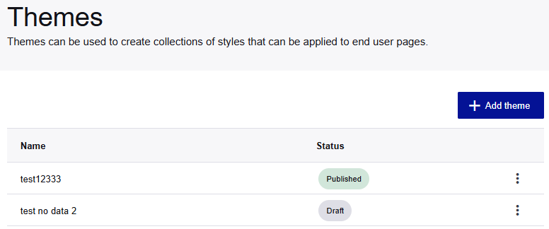
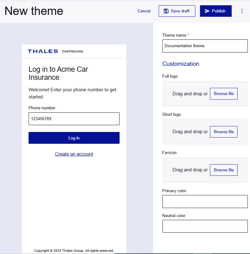
The Themes page lists the themes that you create for your tenant. When you customize theme elements, the image on the left is updated with your changes, so you can see what they look like. After you create a theme, you can associate it with a brand.
A theme remains in the Draft state until you publish it. Only published themes are available to associate with a brand.
-
On the OneWelcome Identity Platform admin console, select Look and feel > UI Customization.
-
On the Themes page, select Add theme.
-
Enter a Theme name.
After you enter a name, you can Save draft your theme at any time.
Logos and colors
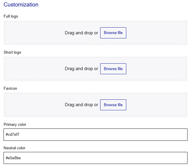
You can customize the logos, favicon, and colors. All of these customizations are optional.
-
In the Customization section, drag and drop or browse for the image files that you want to use:
-
Full logo: This is the desktop version of the logo that can use the full width of the page. It is displayed in the top-left corner of the page. Users see this logo only in desktop view. The maximum file size for the full logo is 256 KB.
-
Short logo: This is the mobile or narrow screen version of the logo. Users see this logo only in mobile view. The maximum file size for the short logo is 256 KB.
-
Favicon: This is displayed in browser tabs and bookmarks. The maximum file size is 64 KB.
You can upload logos in PNG, JPG, JPEG, or SVG formats.
-
-
To customize the Primary color, enter the hexadecimal value.
The primary color is used for key actions and branding elements, like buttons and links
-
To customize the Neutral color, enter the hexadecimal value.
The neutral color forms the foundation of the interface, providing balance and clarity, such as the word or and the horizontal line on the login screen
Font and font size
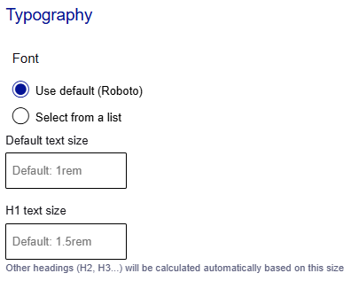
You can customize the font and font sizes for text and headings.
-
In the Typography section, select the font:
-
Use default (Roboto)
-
Select from a list: In the Font family list, select the font that you want to use.
-
-
Enter the Default text size. Include the value and the unit of measurement.
-
Enter the H1 text size. Include the value and the unit of measurement. The text sizes for other headings are calculated based on this value.
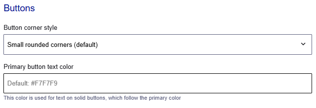
Buttons
You can customize the corner style and text color for buttons.
-
In the Buttons section, select the Button corner style.
-
Enter the Primary button text color as a hex value, such as
#F7F7F9.
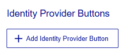
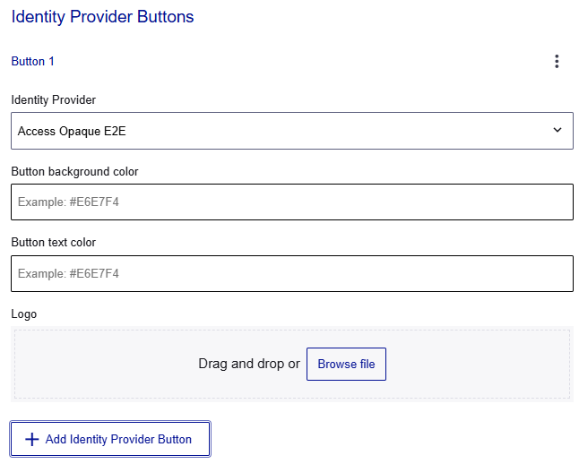
Identity provider buttons
You can add a button for each external identity provider (IDP) that is configured in the Identity Broker, including social identity brokers like Facebook or Google.
Note
Ensure that the colors and logo follow the trademark and branding guidelines for each external IDP.
-
Under Identity Provider Buttons, select Add Identity Provider Button.
-
Select the Identity Provider.
-
Enter the Button background color and Button text color in hexadecimal format, such as
#E6E7F4. -
Add a Logo file.
You can upload logos in PNG, JPG, JPEG, or SVG formats.
-
To add another IDP button, select Add Identity Provider Button and repeat these steps.
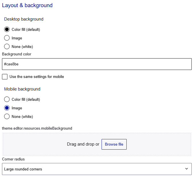
Background
You can customize the background for desktop and mobile devices. You can select a background image or color, and the background corner style.
-
Under Layout & background, select a Desktop background option:
-
Color fill (default): Enter the Background color in hexadecimal format, such as
#E6E7F4. -
Image: Upload the Background image. You can upload logos in PNG, JPG, JPEG, or SVG formats.
-
None (white)
-
-
For mobile devices, you can either use the same settings that you used for desktops, or you can customize them:
-
To use the same settings that you used for desktops, select Use the same settings for mobile.
-
To customize the settings on mobile devices, do not select Use the same settings for mobile and select a Mobile background option:
-
Color fill (default): Enter the Background color in hexadecimal format, such as
#E6E7F4. -
Image: Upload the Background image. You can upload logos in PNG, JPG, JPEG, or SVG formats.
-
None (white)
-
-
-
Select the Corner radius.
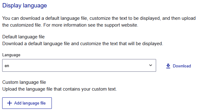
Display language
The text that is displayed for your users is contained in language files in JSON format. There is a file for each language.
You can download a default language file, customize the text, and then upload the customized file with the same filename. For example, to change some of the text on the English screens, download the English language file (en.json), customize the text, and then upload the file.
Before you add a language, make sure that your tenant supports that language.
-
To customize a language file, under Display language, select the Language file that you want to customize.
-
Select Download.
-
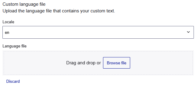
Open the JSON file in any text editor, customize the values, and save the file with the locale filename.
-
When you're done, under Custom language file, select Add language file.
-
Select the Locale for the language file. The locale is associated with the language selector on the user screens.
-
Select the Language file that you want to upload.
Publish a theme
Themes have two states, draft and published. Published themes are available to associate with your brands, but draft themes are not.
- At the top of the Themes page, select Publish.
Link a theme to a brand
You can link a different theme to each brand in your tenant. The brand uses the styles and the language files that you configured in the selected theme.
-
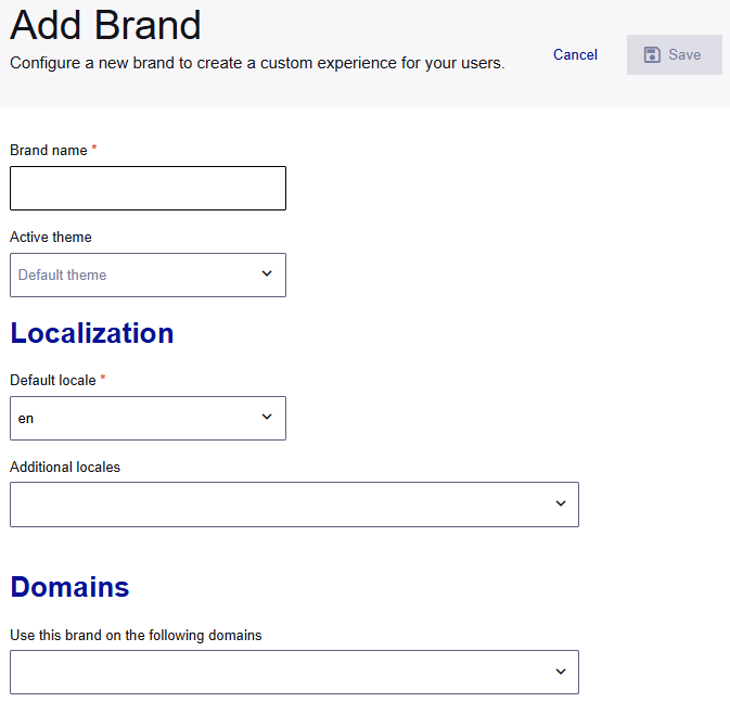
On the OneWelcome Identity Platform console, select Tenant settings > Brands.
-
On the Brands page, select your brand or create a new one.
-
In the Active theme list, select the theme that you added and published.
-
Configure the remaining options as needed.
-
Select Save.