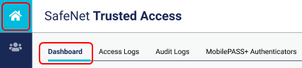
Dashboard
The dashboard on the STA Access Management console provides an at-a-glance view of usage and of attempts to access your protected applications and resources. It allows you to understand trends and quickly identify failed or denied access attempts, so that you can manage network operations efficiently. It shows the access attempts per day, per policy, and per application.
The dashboard represents the traffic that is generated from:
Show the dashboard
-
Select Home and then select Dashboard.
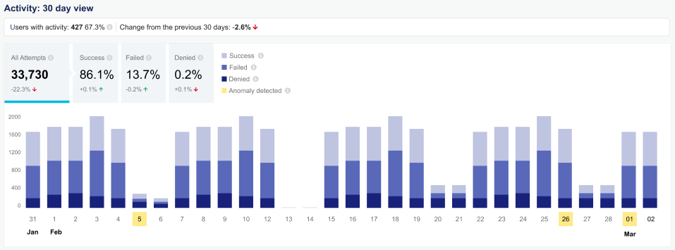
The dashboard shows the users with activity as a number and as a percentage, as well as the change from the previous 30 days.
The histogram represents all access attempts in the last 30 days.
-
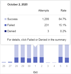
Hover over a histogram bar to show the access attempts and rate for a particular day.
-
To view the corresponding access logs, click Failed, Denied, or Success. The access logs are automatically filtered to display only the corresponding records.
The ability to view the corresponding access logs is available for only STA and STA Premium plans.
Summary of access activity
The dashboard includes a summary of access activity in the last 30 days.
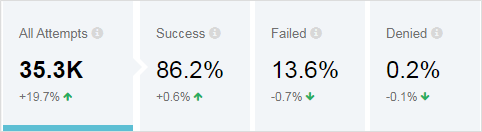
It includes a breakdown of the access attempts:
-
All Attempts: The total number of access attempts in the last 30 days, excluding access attempts by operators or by the REST API for STA.
-
Success: The percentage of those access attempts that were granted.
-
Failed: The percentage of those access attempts that were rejected because of failed authentications.
-
Denied: The percentage of those access attempts that were rejected by configured rules, such as access policies or application assignments.
It also includes a comparison to the previous 30-day period:
|
 |
Access attempts in the last 30 days.
|
 |
The comparison to the previous 30-day period is displayed as a percentage and can include these symbols: + A plus sign indicates an increase. - A minus sign indicates a decrease.
∞ (All Attempts only) An infinity symbol indicates that there is no previous period for a comparison. |
|
 |
Hover over the comparison to show the value from the previous period. |
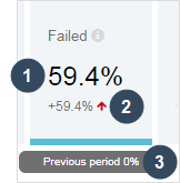
 A red up or down arrow indicates that the change is not desirable and might warrant further investigation.
 A green up or down arrow indicates that the change is desirable.
All Attempts values
-
30-day period: In the All Attempts section, the value for the 30-day period is a count of all access attempts.
-
Comparisons: The comparison to the previous period is in the following range:
(-100%, ∞)
Within that range, the values use the following formats:
-x.x% Range (-100 to 0) -0.0% Anything close to zero from the left, or negative, side 0 (without the percent symbol) Exact zero +0.0% Anything close to zero from the right, or positive, side +x.x% Range (0, 200%) x.x×.* Range (200%, 900%) ≥10× Anything in the range (900%, ∞) ∞infinity symbol There’s no previous period
Success, Failed, and Denied values
-
30-day period: In Success, Failed, and Denied sections, values for the 30-day period are a proportion of the number of all access attempts in the last 30 days. They are percentages in the following range:
[0%, 100%]: o
Within that range, the values use the following formats:
0% (with the percent symbol) Exact zero or anything close to zero from the right, or positive, side. x.x% Anything over 0. -
Comparisons: The comparisons with the previous 30-day period are a percentage points variation, relative to the percentage of Success, Failed, or Denied attempts in the previous 30-day period.
The percentages are in the following range:
[-100%, 100%]
Within that range, the values use the following formats:
-x.x% Range (-100 to 0) 0 (without the percent symbol) Exact zero +0.0% Anything close to zero from the right, or positive, side +x.x% Range (0, 100%)
Access activity details
By default, the summary of access activity and the histogram show all access attempts in the last 30 days. You can filter the histogram to show only Success, Failed, or Denied access attempts, and to show more details about the filtered access attempts.
This functionality is available for only STA and STA Premium plans.
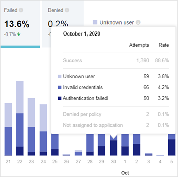
You can also view the access and authentication logs that relate to any day, result, or reason in the 30-day histogram. You can drill into trends of interest, including trends where an anomalous failure rate is highlighted. If the histogram displays Other reasons, you can view the access and authentication logs to see the full list of reasons.
-
In the summary of access activity, select either Success, Failed, or Denied.
The histogram displays only those access attempts. For example, if you select Failed, the histogram displays only Failed access attempts.
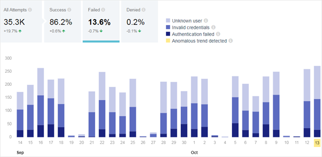
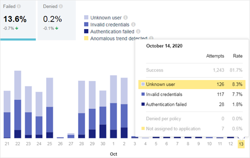
When you filter on Failed or Denied access attempts, the histogram shows the failed or denied reasons. It can show up to four failure reasons. If there are more than four failure reasons, then only the three most common reasons are shown, and all other failure reasons are grouped into a category named Other.
-
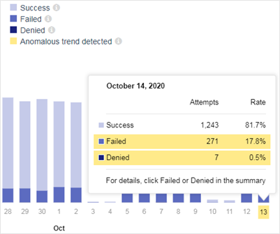
To show details for a particular time period, such as the number of attempts and rate for each failure reason, hover the mouse over a histogram bar.
-
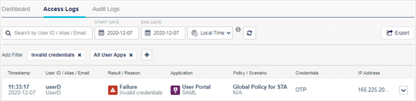
To view the corresponding access logs, click the reason code.
The access logs are automatically filtered. The All User Apps filter is always selected, because the dashboard shows access attempts for all applications that are accessed through STA.
This feature is available for only STA and STA Premium customers.
Anomalous trends
On the dashboard, the histogram includes an anomalous trend indicator that highlights the days when an anomalous trend was observed and identifies the associated reason codes.
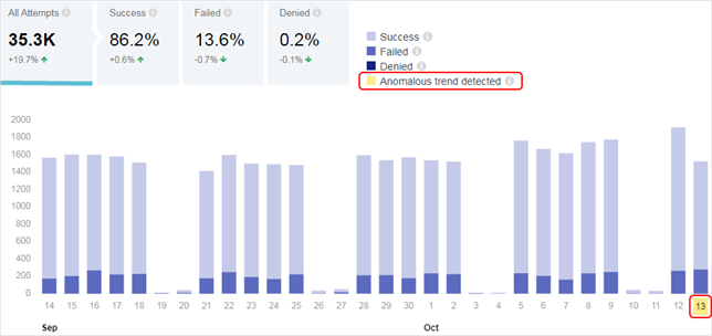
These unsuccessful access attempts could be anomalous because they occurred too frequently or because they have specific reason codes that should not normally occur.
STA performs trend analysis to avoid generating false positives and to detect anomalies that occur for only a small portion of the day. To perform the analysis, the daily traffic is split into samples of varying duration, so that a test sample lasts longer in times of low traffic than in times of high traffic. Each sample covers a multiple of one-hour time buckets. The shortest sample covers one hour of traffic, and the longest sample covers the entire day.
Each sample typically counts at least 100 events, and triggers an anomaly if the number of events with a particular reason code is greater than the system’s threshold. There is a specific threshold for each reason code. A sample with fewer than 100 events can still trigger an anomaly if the number of failed or denied access attempts exceeds the system's threshold.
Some reason codes can even trigger an anomaly for a single occurrence:
-
CA revocation check failed
-
Certificate attribute not found
-
Chain verification check failed
-
Issuing CA expired
-
Service disabled
-
System issue
-
User revocation check failed
This feature is available in the STA and STA Premium subscription plans. It is not available in the STA Basic plan.
Investigate anomalous trends
When an anomalous trend is detected, the date is highlighted on the histogram.
-
Hover over the bar for the highlighted date.
The highlighted area indicates whether the anomaly is for Failed or Denied access attempts.
-
In the summary at the top, select the corresponding type of access attempts. For example, if Failed is highlighted, select Failed in the summary.

-
Hover over the bar for the highlighted date.
The reason codes are listed, along with the number of access attempts and the rate. Any reason code with an anomalous trend is highlighted.
-
To view details about the access attempts, select the reason that you want to investigate.
The access logs are automatically filtered to show the corresponding logs.
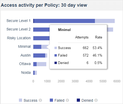
Access activity per policy or per application
The dashboard also shows the access activity per policy and per application for the last 30 days:
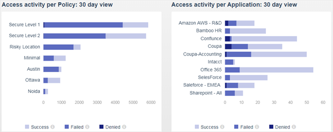
To show details for a particular time period, such as the number of attempts and the rate, hover the mouse over a histogram bar.